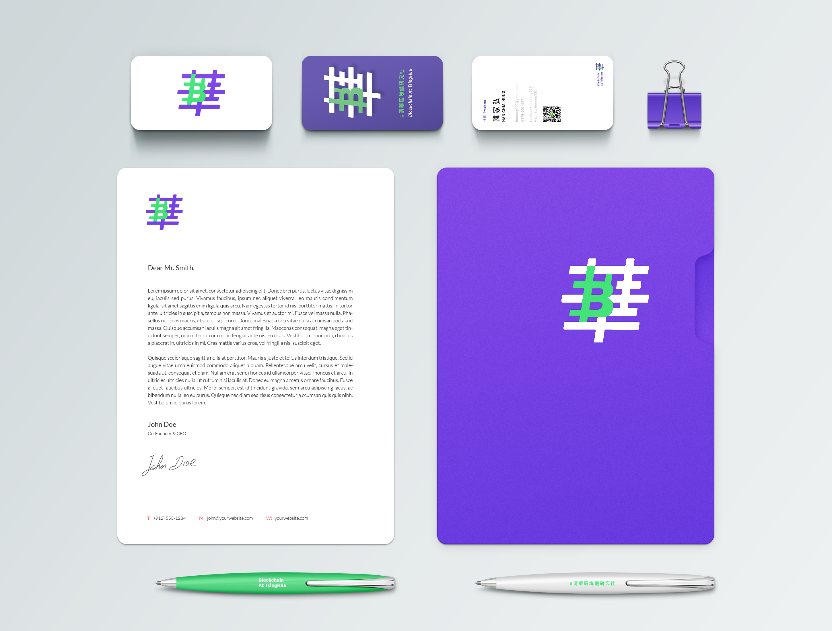
Blockchain at NTHU
Brand Identity
Client ︎︎︎ Blockchain at NTHU
Year ︎︎︎ 2020
To create a new identity for Blockchain at
NTHU and to achieve a more effective and intuitive communication design, I
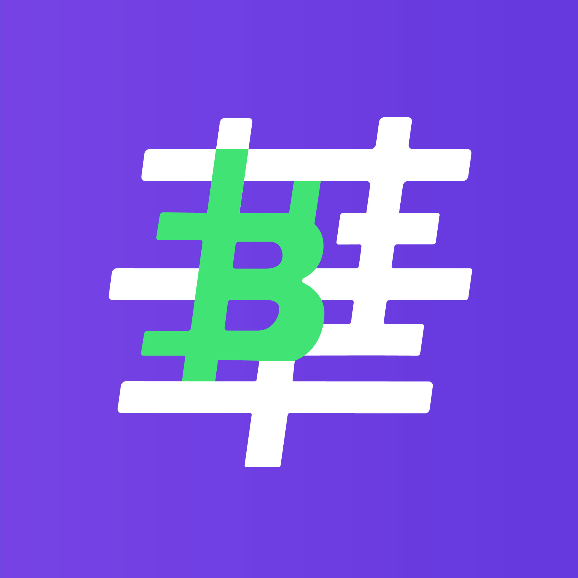
decided to keep the original LOGO's "華" and the purple color in the early discussions with the
client.
I developed a new skeleton for the Chinese logotype, and for the selection of English typeface, I chose the modern, smooth and curvy "Lota Grotesque" family for matching.
I developed a new skeleton for the Chinese logotype, and for the selection of English typeface, I chose the modern, smooth and curvy "Lota Grotesque" family for matching.
As the most representative blockchain application, the symbol of Bitcoin is $ plus the B of Blockchain.
This symbol is specifically included in the logo without troubling the structure of the original "華" character.
In response to the rapid changes in Fintech, a 6-degree tilt angle is added to express the sense of speed, and it is also linked to the # symbol representing the hashtagging online community.
︎