Data Visualize Everything
Data Visualization, Interactive Website
2021
01. Visualize AIGA Graphic Designer Pay Transparency
︎︎︎Interactive Website
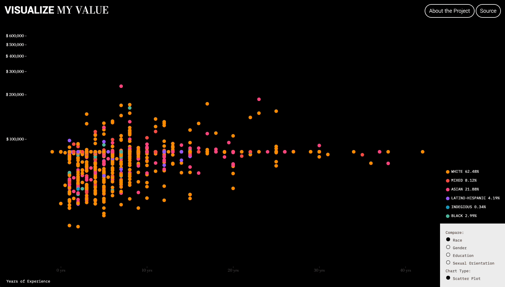
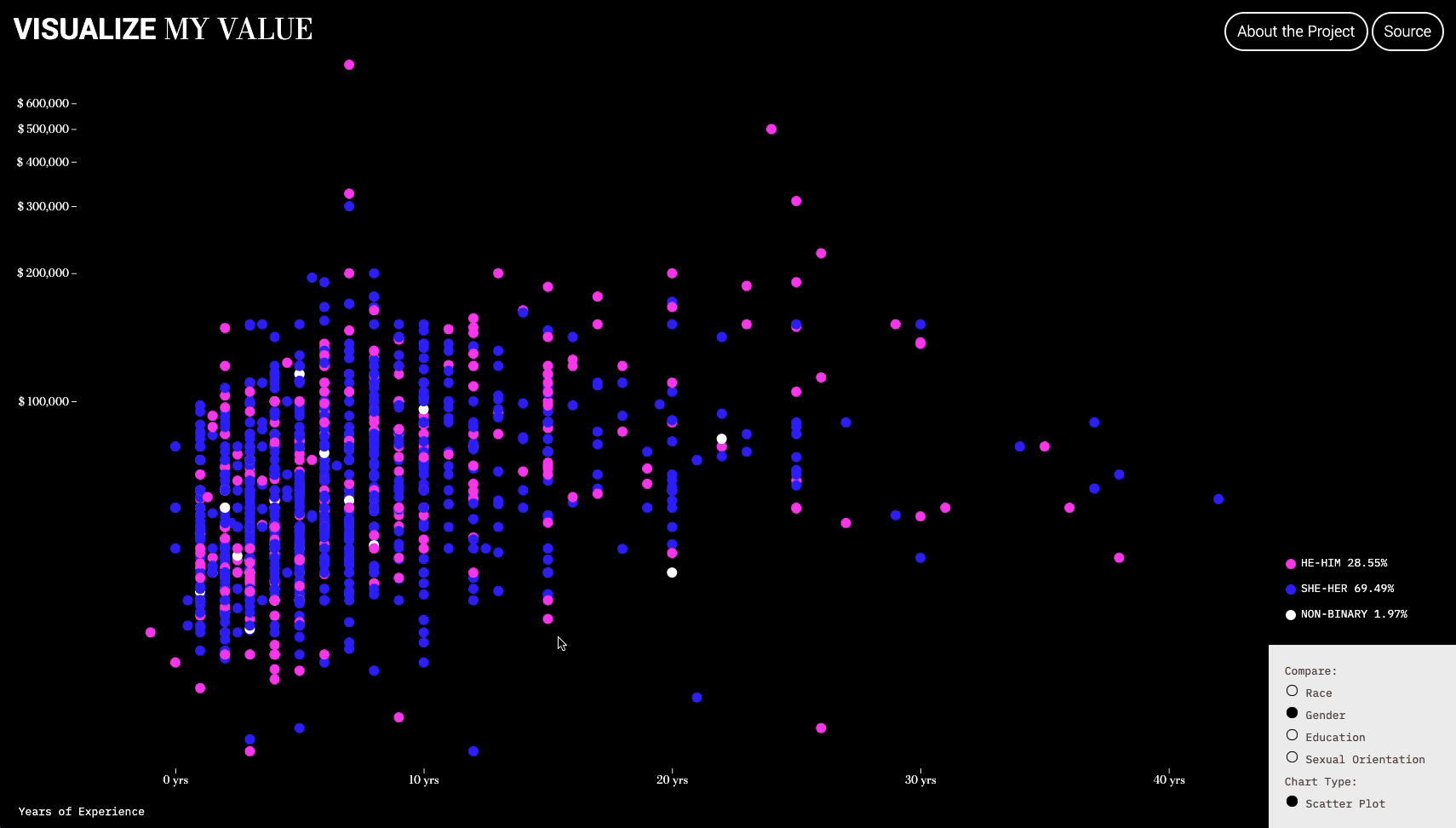
Visualize My Value is a data viz project uses datasets from AIGA anonymous Graphic Design Salary Transparency spreadsheet.
Capitalism, along with its inextricably linked relationship with Communication Design has locked it in a system of exploitation and profit. (Ruben Pater, 2021) Thus, it is more important than ever to advocate a design salary transparency in this century utilizing the power of data visualization.
What determines your salary, your experience, gender, education, sexual orientation or race?
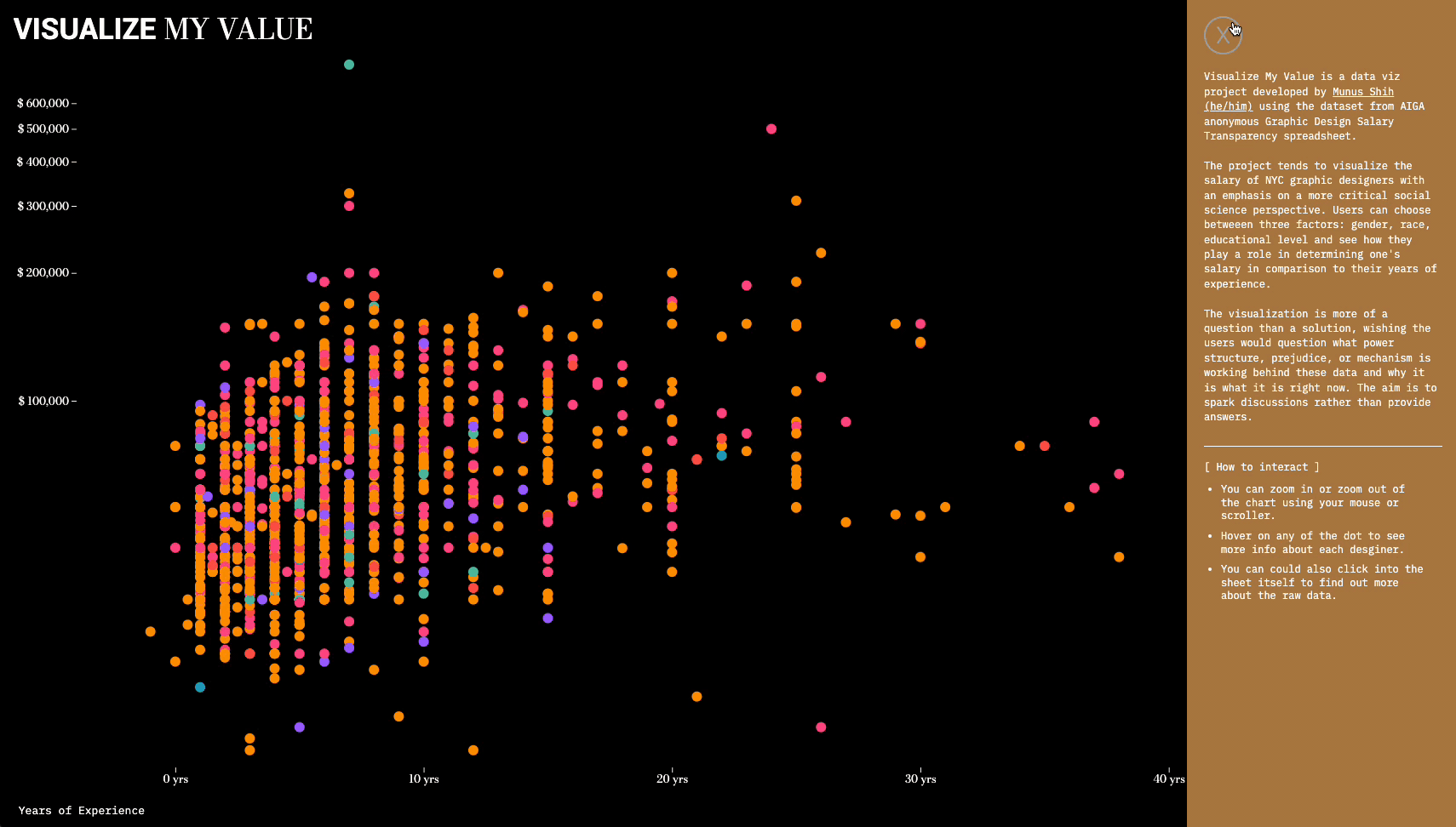
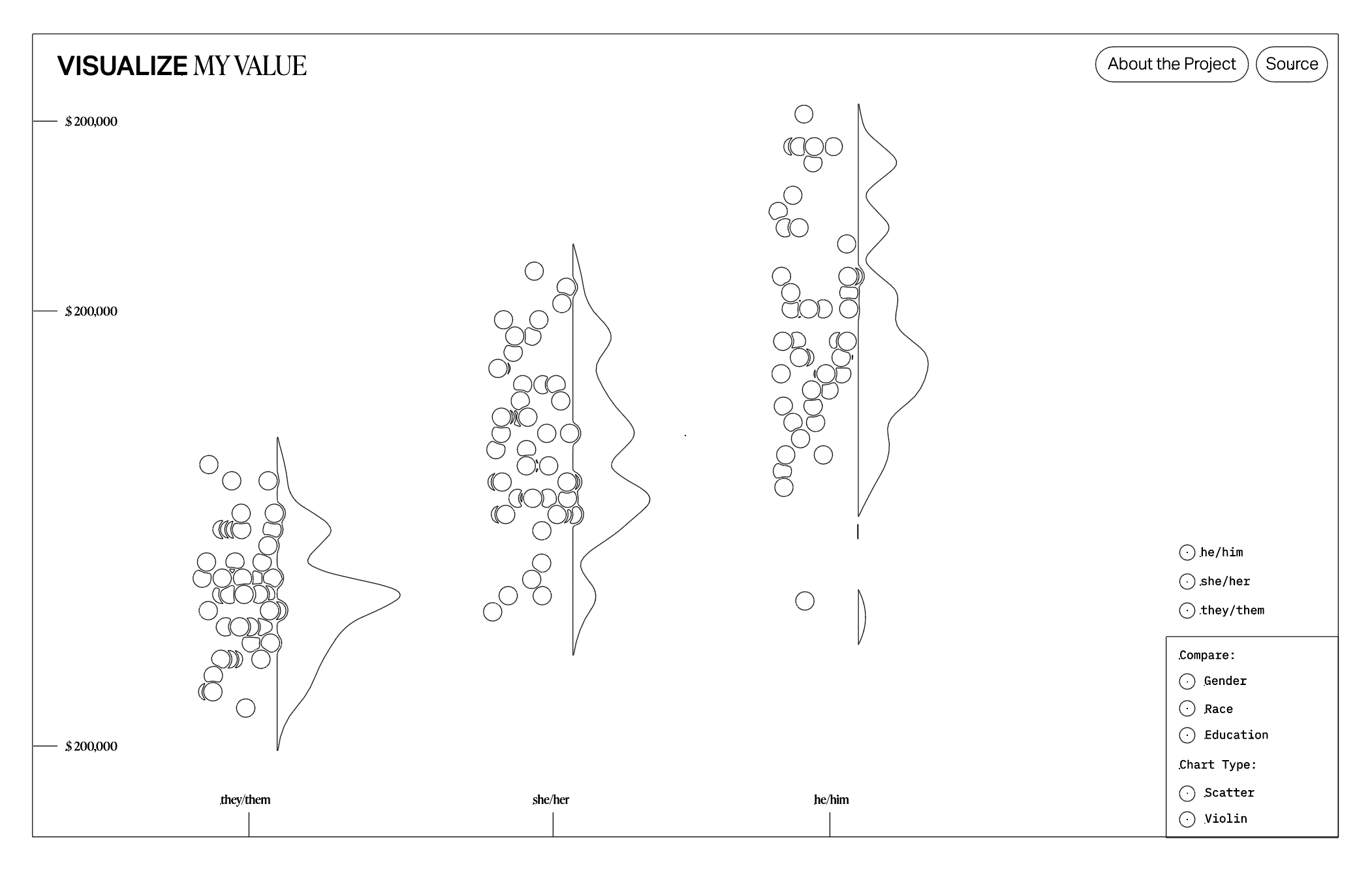
The project tends to visualize the salary of NYC graphic designers from a more critical social science perspective. Users can choose between three factors: gender, race, educational level and examine how they play a role in determining one's salary compared to their years of experience.
︎︎︎Pitch Deck
I was influenced by the project "Humans in Space" (Projects.two-n.com. 2021) designed by project two. and realized that by leveraging the affordance of interactive interfaces experience (Keramidas, K., 2015), I could design a more explorative data viz project for the users to investigate these power dynamics themselves, and ultimately contribute to a decentralized community of storytelling (Winger-Bearskin, A., 2021)
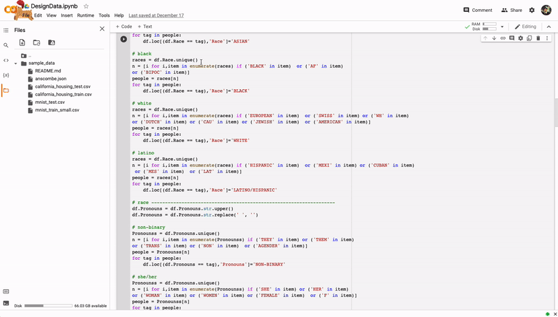
Since the dataset was really dirty, I used Python to perform data pre-processing. Through the process, I was able to experience the administrative violence Keyes mentioned in their article. Due to the nature of the spreadsheet, there are way too many unique values in one category and I had to categorize them manually. It was easy for questions like education levels but difficult for races, genders, or sexualities.
For instance, I was forced to categorize everyone who did not fit into binary gender into "non-binary" otherwise I wouldn't be able to color-code it. I was also forced to categorize a lot of white or white-passing people into the section "White", and a great majority of people into "mixed as it refers to both mixed-race or mixed-ethnicity.
The visualization is more of a question than a solution, question what power structure, prejudice, or mechanism results in this phenomenon from data feminism point of view.
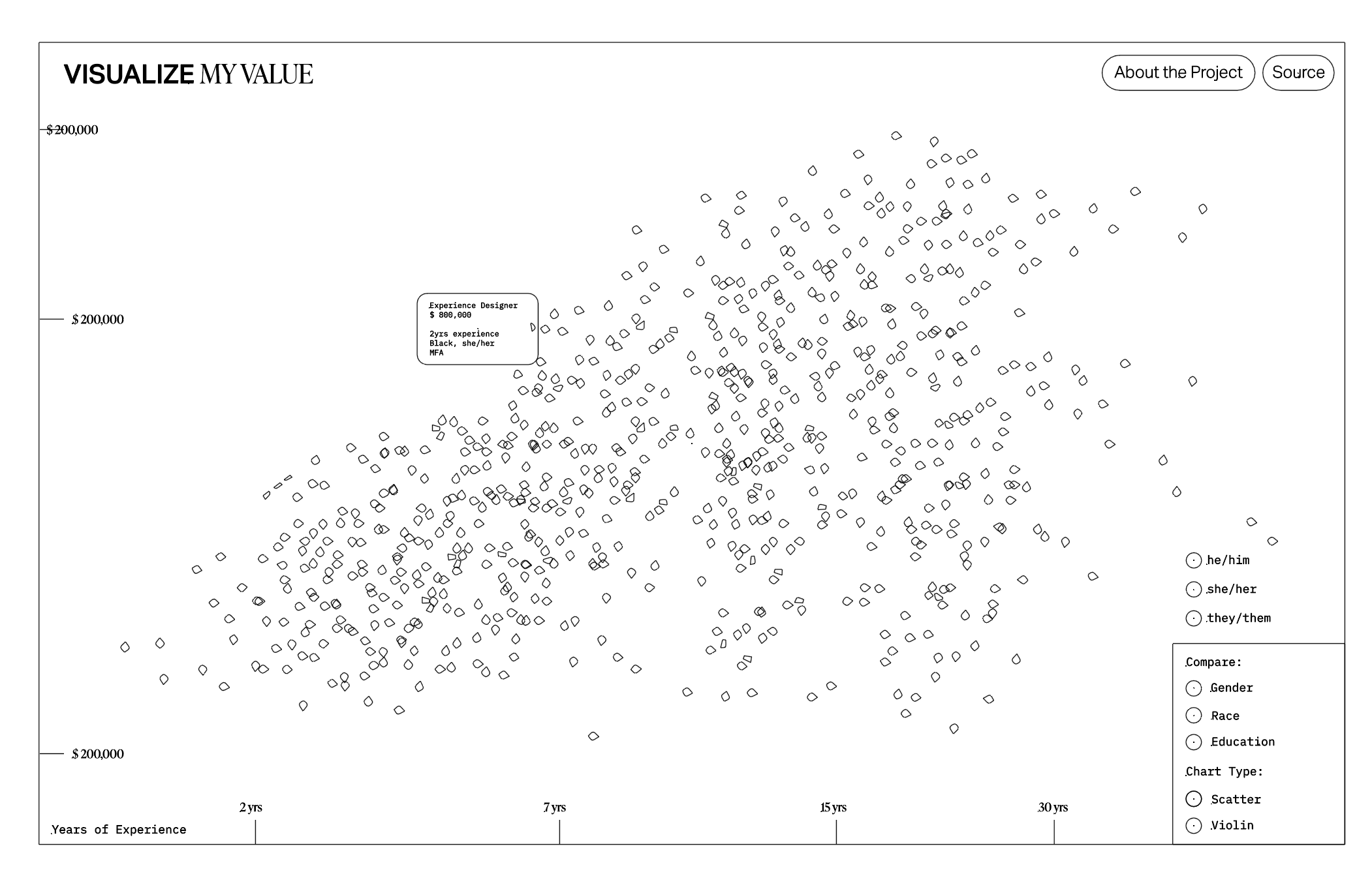
Every point represent a person. I decided to illustrate all the data points in a scatter plot so by zooming into these data, the user can actually see more info about every one of them, looking into their individuality and how it is influenced by this great structure of capitalism. Question what is behind these data and why it is what it is right now, the aim is to spark discussions rather than provide answers.
Every point represent a person. I decided to illustrate all the data points in a scatter plot so by zooming into these data, the user can actually see more info about every one of them, looking into their individuality and how it is influenced by this great structure of capitalism. Question what is behind these data and why it is what it is right now, the aim is to spark discussions rather than provide answers.
02. Visualize NYC Air Quality
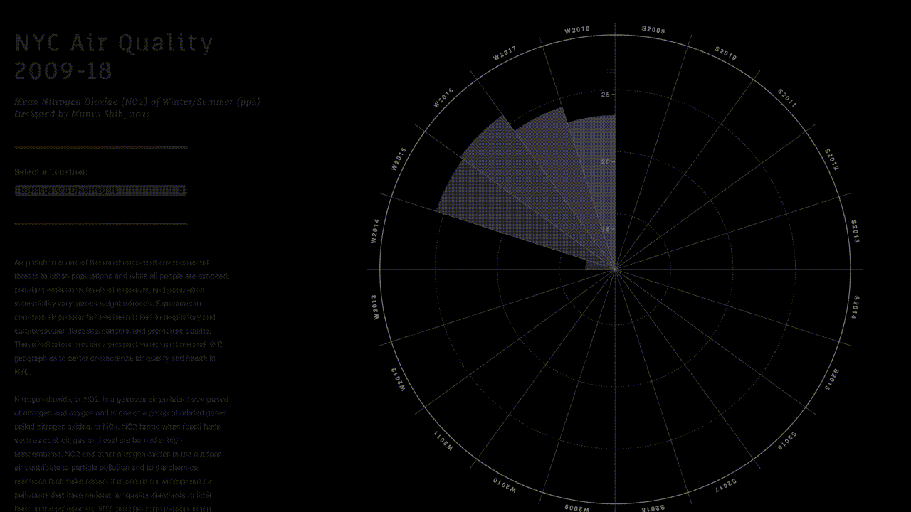
Air pollution is one of the most important environmental threats to urban populations. By extracting data from OpenData NYC, I used D3.js to visualize the Mean Nitrogen Dioxide (NO2) of Winter/Summer in NYC from 2009-2018.
Users can interact with the chart by selecting different areas of NYC and see how it’s changing.
︎︎︎Interactive Website
03. Visualize NYC/Taiwan Time Difference
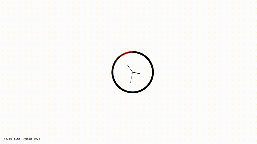
Despite looking like a normal clock at first glance, it expands into a multi-dimensional clock.
By clicking onto it, the users get to see a more nuanced difference in my daily schedule visualizing in arcs, visualizing the missing 12-hour-difference between Taiwan and New York.
︎︎︎Interactive Website
By clicking onto it, the users get to see a more nuanced difference in my daily schedule visualizing in arcs, visualizing the missing 12-hour-difference between Taiwan and New York.
︎︎︎Interactive Website