Experimental typography series
Campaign Design, Posters, Books
Year ︎︎︎ 2018
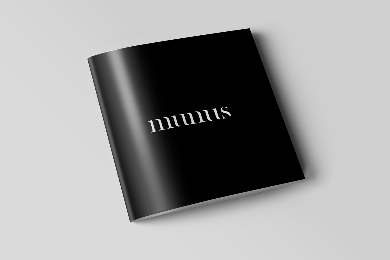
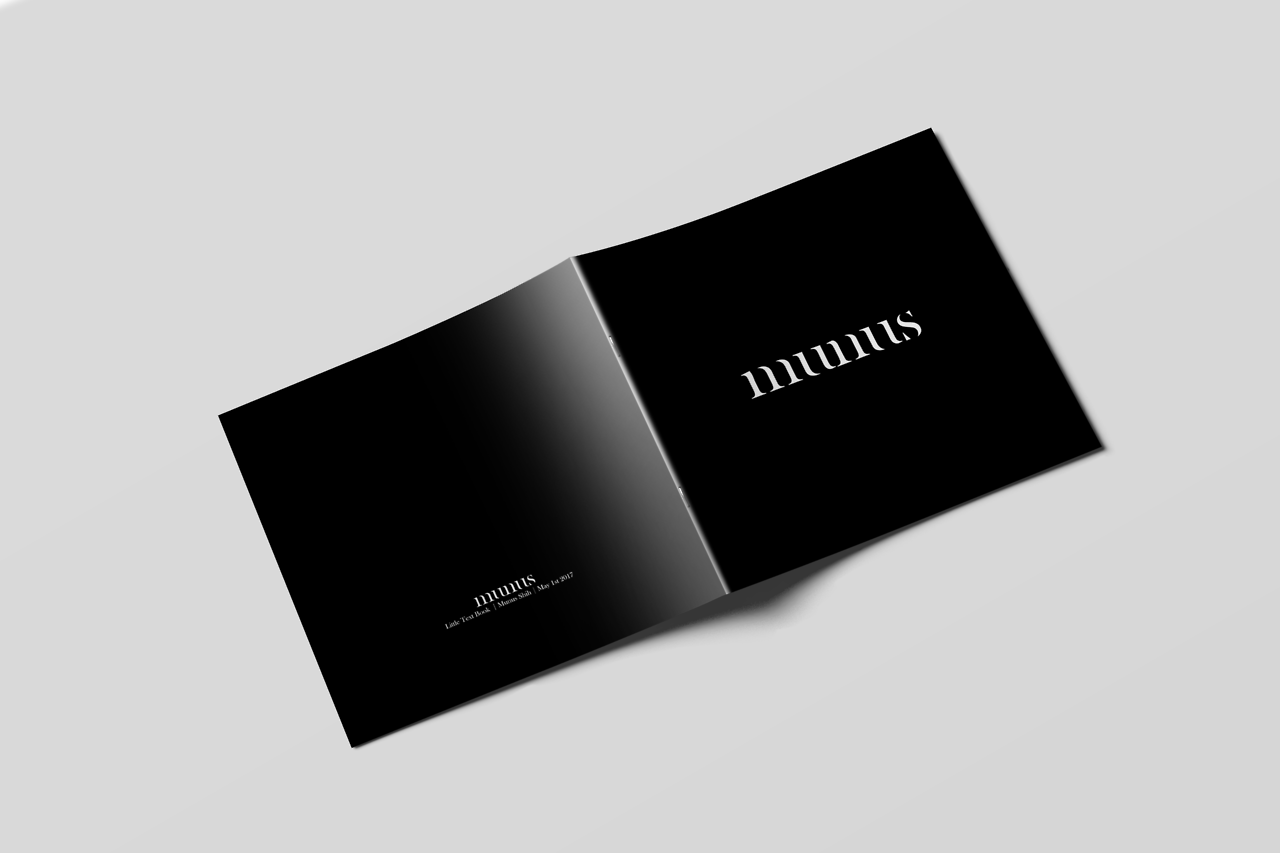
An experimental booklet that uses only the font Baskerville Old Time that I did in class while exploring the possibilities of type, text, space, and texture in grayscale printing.


This is an experimental work I did in my graphic design class, a small booklet purely arranged with the classic font Baskerville.
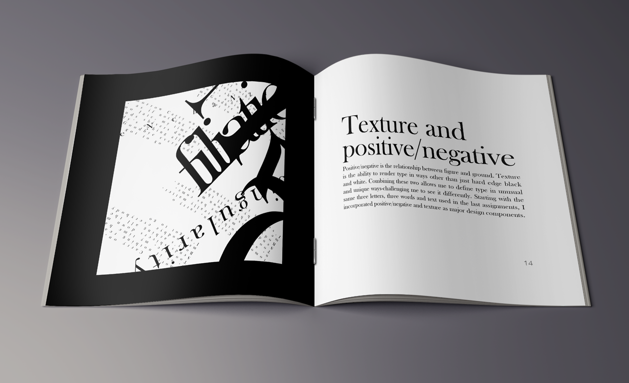
Under the premise of scaling, rotating but not deforming the font, the experiment was carried out. I tried to express the beauty of Baskerville with different typography strategies and some materials are also added.


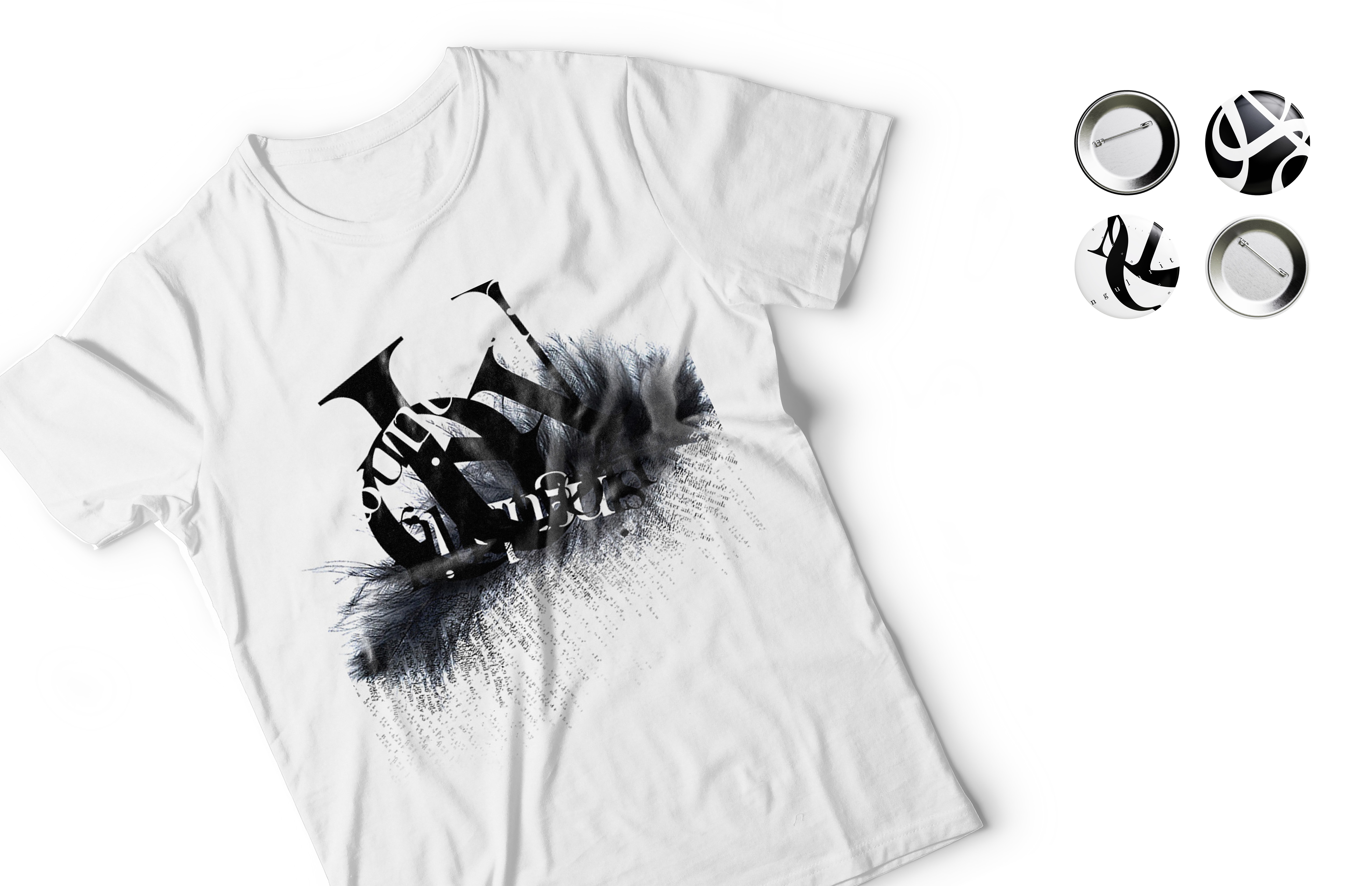
The inner pages of the booklet were divided into four sections: Letterforms / Letterforms and Words / Letterforms, words and texts / Texture and Negative Positive Space. The Merches are also designed based on the inner pages of the experimental typography booklet.
Finally, aiming at the proposition of the font experiment, I use common objects in life, such as the reflective metallic duct tape to arrange in alphabet M to design a poster.
Finally, aiming at the proposition of the font experiment, I use common objects in life, such as the reflective metallic duct tape to arrange in alphabet M to design a poster.


︎